


#Graphics #Branding
Max Huber Typography Analysis
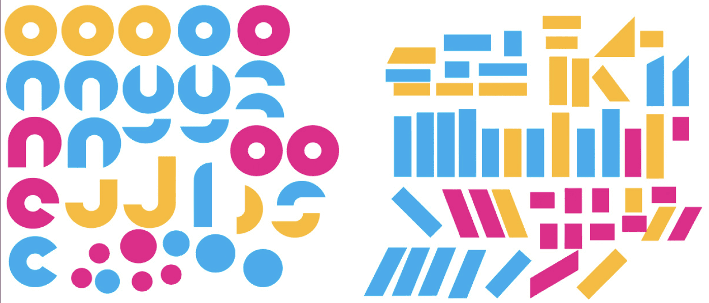
Modular font case study. A poster tribute to Max Huber’s graphic language, built from rhythm, contrast, and modular form.
This project required thorough analysis of the font created by Studio K95 as homage to a famous figure in graphic design Max Huber, and my job was to dissect the patterns of this font, analyse the way it is constructed and come up with a grid that would fit into the font system as well as changing some of the letters in a way that maintains the font structure and overall aesthetics.